BLOG
COLOR OF THE YEAR 2022 BY PANTONE
The month of December is an eventful one, the traditional long-awaited announcement of Pantone color of the year 2022 is finally here.
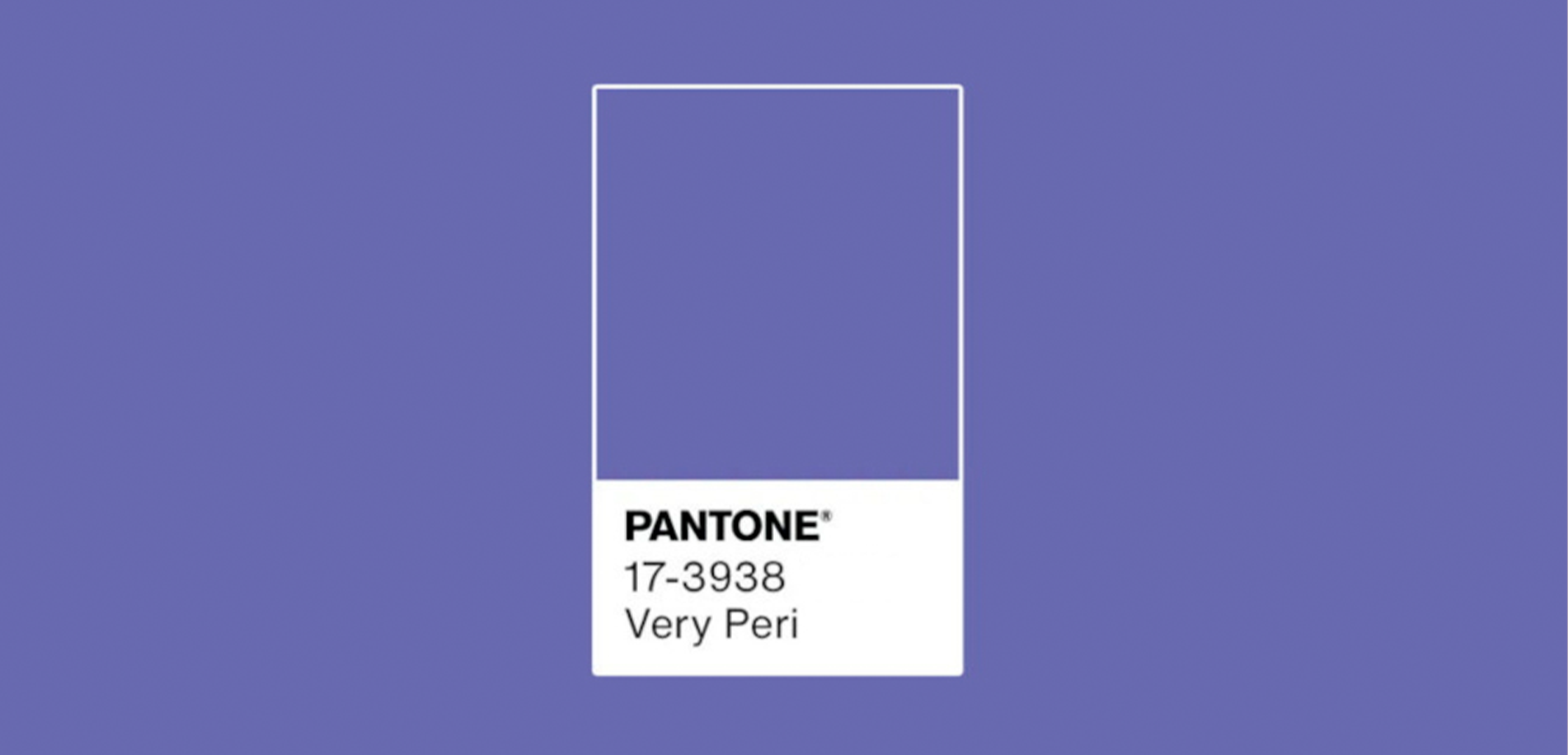
Like always, the Institute of Pantone surprises all the artists, designers, architects, fashionistas, and all the creative people out there with the Pantone color of the year. And this time was no exception, please welcome PANTONE 17-3938 Very Peri – a completely new and groundbreaking color shade created by using digital technologies.
A truly imaginary vision of pure inspiration and enthusiastic innovation from the Pantone Institute experts who explained their choice for 2022 this way:
“A New Pantone Color Whose Courageous Presence Encourages Personal Inventiveness And Creativity.” – by PANTONE.
Image credit by Pantone @Facebook
What’s interesting is that in color psychology, this visionary and artful hue represents a royal color. The color meaning is linked to intelligence, openness to experience, luxury in its different displays, creative magnificence, and artistic honesty alongside.
Leatrice Eiseman, the executive director of the Pantone Color Institute, outlines: “As we move into a world of unprecedented change, the selection of PANTONE 17-3938 Very Peri brings a novel perspective and vision of the trusted and beloved blue color family, encompassing the qualities of the blues, yet at the same time with its violet red undertone, PANTONE 17-3938 Very Peri displays a spritely, joyous attitude and dynamic presence that encourages courageous creativity imaginative expressions.” “The Pantone Color of the Year reflects what is taking place in our global culture, expressing what people are looking for that color can hope to answer.” – emphasized and added Laurie Pressman, Vice President of the Pantone Color Institute – “Creating a new color for the first time in the history of our PANTONE Color of the Year educational color program reflects the global innovation and transformation taking place. As society continues to recognize color as a critical form of communication, and a way to express and affect ideas and emotions and engage and connect, the complexity of this new red violet infused blue hue highlights the expansive possibilities that lay before us”.
Therefore, perhaps in some ways in this year’s choice echoes the meaningful beauty of Pantone color of the year 2020 – PANTONE 19-4052 Classic Blue. As mentioned before, from a color perspective, the blue color family reveals a challenging inner power, abundant creativity, profound admiration of courage, and a peaceful state of mind.
It is worth noting that for many years the annual Pantone color forecast has been a major key color guideline across many lifestyle aspects and product development industries. Fashion, jewelry, interiors, lighting, furniture, textiles, tableware, and wall dressings companies always follow its lead.
Year after year, The PANTONE Institute reveals one color (sometimes the duo) to guide professionals through the seasons. It determines the color directives and trends that appear most often in design, decor, and lifestyle. It can also be tracked in brand-new fashion collections, different interior oriented events and exhibitions like run-way fashion shows, interior design fairs such as Salone Del Mobile Milan Design Week, Maison et Objet Paris, Stockholm Furniture & Light Fair, LA Design Festival, Imm Cologne, or Decorex London, etc.
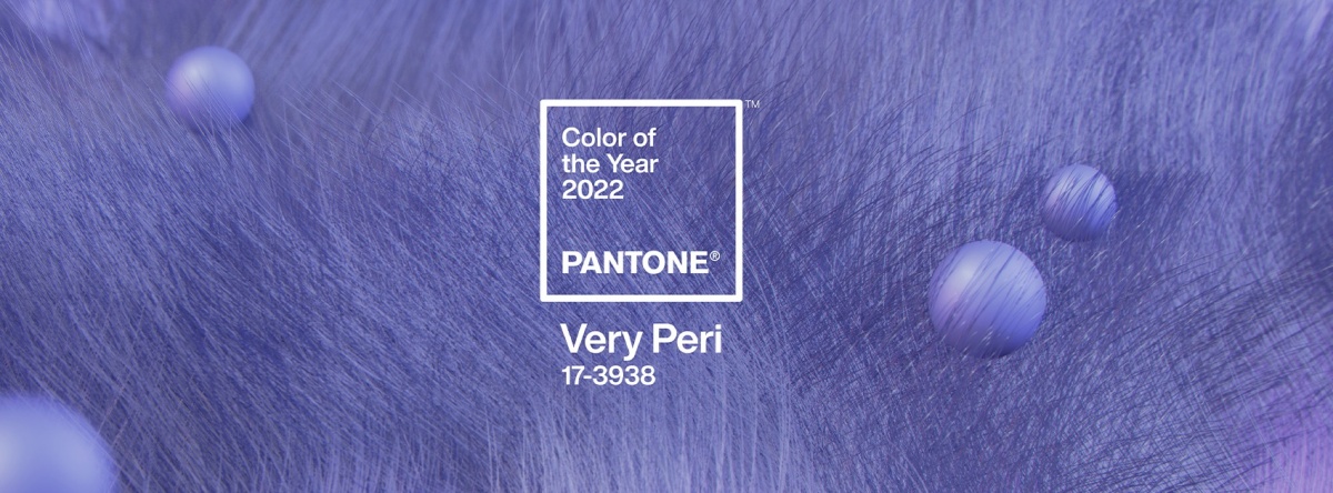
Image credit by Pantone @Facebook
On this occasion, the lead professionals from the Pantone Institute unveiled more about their color decision: “We are living in transformative times. PANTONE 17-3938 Very Peri is a symbol of the global zeitgeist of the moment and the transition we are going through. As we emerge from an intense period of isolation, our notions and standards are changing, and our physical and digital lives have merged in new ways. Digital design helps us to stretch the limits of reality, opening the door to a dynamic virtual world where we can explore and create new color possibilities. With trends in gaming, the expanding popularity of the metaverse and rising artistic community in the digital space PANTONE 17-3938 Very Peri illustrates the fusion of modern life and how color trends in the digital world are being manifested in the physical world and vice versa.”
The Pantone’s representatives also pointed out the following: “Displaying a carefree confidence and a daring curiosity that animates our creative spirit, inquisitive and intriguing PANTONE 17-3938 Very Peri helps us to embrace this altered landscape of possibilities, opening us up to a new vision as we rewrite our lives. Rekindling gratitude for some of the qualities that blue represents complemented by a new perspective that resonates today, PANTONE 17-3938 Very Peri places the future ahead in a new light.”
Now it’s our turn to implement this breathtaking color and make the magic happen.
Credits pantone.com